|
“Gone But Not Forgotten” Several years ago I took this photograph of an old barn just west of my hometown. A few years ago it was demolished, and replaced with a brand new nondescript “barn”. I pass by the site often and remember the old barn, and decided to give it new life in a painting. 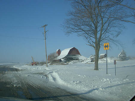 To give the old barn new life, I eliminated all of the extraneous objects and just focused on the cold snow. The flat winter sky didn’t give the barn the drama that I wanted, so I added a sky from another photograph and adjusted the colors. The next decision that I had to make was the composition. To get the “feeling” of abandonment of the old barn, I composed it with very little else in the picture space. This created a problem.
There are no rules on composition, but there are some basic principles–one of which is that a composition should have balance with the positive and negative spaces. The barn and some of the cumulus clouds are the only positive shapes. That does not balance with the rest of the picture space which is negative space. ( Positive space is any object that has 3-dimensional form, and negative space is anything that is flat.) One way of balancing the composition is to use detail or texture or color in the negative spaces. Doing “safe” compositions is easier, but not as much fun!
3 Comments
Website has been down for a week.
Testing to see if it is now working. Computers are mysterious!!! Have a great day! We are pleased to inform you that your work has been accepted into the 156th Annual International Exhibition of the American Watercolor Society. The exhibition will be held at the Salmagundi Club in New York City April 3-28, 2023.  A good start for the new year.
I started teaching a watercolor class in my hometown, Kaneville, IL in 2006 and have continued to the present day. Most Fridays I do a demonstration painting from start to finish. We were interrupted for a few months due to the pandemic. These are the demos from this past year. Happy new year and paint! I am trying to post a new blog and facebook is not cooperating. Sorry for ther confusion. I will post when I figure it out.
 Step 6 More scrubbing in the foreground defines the ground planes. Step 7
Scrubbing back to the white of the paper flattens the space. Therefore, I had to add some color to some of the “scrubbed” areas. Because there is almost no internal sizing in this paper, I had to add some, using a solution of gum arabic and water and sprayed that on the entire paper. Gum arabic is the sizing that is used in most papers. If I didn’t resize the paper, the color would soak into the paper and end up as a dull less intense color. At this stage of the painting, I usually leave it as is for a time. Slight adjustments to color, value, edges and detail will be added when I look at it with a fresh eye.  Step 4 Finishing the first wash with the same colors and slightly darker values and a few highlights of the warm sky color connects the foreground to the rest of the composition. Because the values in the foreground are similar to the values in the middle ground, I was able to keep the edges soft.  Step 5
I let the first wash dry and then used a hair dryer to dry it throughly. The beauty of transparent watercolor is in the layering. Because I want soft edges, I painted this layer the same as the first–very wet using the glycerin and water mixture, hoping that it will form a layer and not mix with the first layer. Once this layer dried, I removed some of the pigment by scrubbing with a stiff brush which gave definition to the lake and the buildings and a few trees. Once again I am using Khadi watercolor paper which is very different than all of the other papers that I use. It has very little internal sizing and a lot of external sizing. Because of that, removing paint is very easy.  Step 1 I started by spraying the entire paper with a solution of glycerin and water. Glycerin is the substance in the tube of paint that makes the pigment flow more easily. Adding more glycerin not only allows the pigment to flow more evenly, but as a bonus slows down the drying time. The extra time allows me to paint more slowly to get the right color and value and keep the edges soft.  Step 2 Painting the middle ground with hills, a lake, trees and buildings needed to be painted while the sky was still wet because I wanted soft edges. Too wet and I would get no edge, and too dry I would get a hard edge.  Step 3
Waiting until the surface was a bit dryer, I created the different colors and edges of the varied subjects i.e. hills, trees, lake and buildings. Note that the bottom of the middle ground area is a hard edge. That will be softened when I next paint the foreground with darker values.  Almost finished with my latest painting.
Painting soft edges in transparent watercolor is usually done by painting wet into wet. That works well when painting small. This painting is 16 x 23 inches, and keeping the painting wet and controlling the edges makes it a challenge. So, I experimented with a different strategy. Planting a Tribute For everyone who knew Bill Parks, he does not need an introduction. For those who did not know him, He taught figure drawing at the old American Academy of Art in Chicago. He was a true gentleman, and an excellent teacher, respected by ALL of his students. He lived near Milwaukee, Wisconsin and traveled to the Academy 4 times a week. His commute was three hours–one way! He reduced his teaching schedule when his wife became ill, and when she eventually passed away, reduced his schedule to once a week. Bill and I had a collection of many plants, lining the sunny windows in our classrooms. During his wife’s illness, and his reduced schedule, he asked me to take care of his plants, especially two of his favorite plants. One was a small maple tree and the other an indoor plant, Hatiora Salicorniodes-bottle cactus. Bill passed away in 2003 leaving me with his special plants, which I have tended to ever since. In the winter, I placed the little maple tree under grow lights in the basement. In the summer I gave the tree sunshine outdoors. This year I decided that the little tree should be free from the confines of its pot. The best time to plant trees is in the late summer or early fall. So, I found a perfect spot, and I just recently planted it. I’m keeping a close eye on it. So far, temperatures have been moderate, and it’s receiving the benefits of lots of lightning-enriched rains. I hope it will get established, and survive the coming winter months as a lasting tribute to my friend, Bill Parks. 
|
Archives
March 2023
Categories |


 RSS Feed
