|
I will be giving a demonstration painting for the Illinois Watercolor Society at the Oakbrook Public Library this Saturday, October, 7 from 2 p.m. to 4 p.m. The library is located at: 600 Oak Brook Road Oakbrook, IL 60523 630-368-7700 This is a free event, and open to the public, and all are welcome. Seats are limited, so registration is required. To register for this event, go to: https://oak-brook.libcal.com/event/9804806 
0 Comments
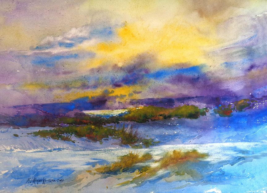 “Clearing" 19" x 26" You can tell a story in many ways. In writing, you can tell a story in a novel or a short story, or even in a poem. You can do the same thing in a painting. You can tell a story using lots of details, or, in a more abstract way, you can leave some of the details up to the viewer to fill in. In “Clearing” I attempted to keep the "story" simple.  Step 1. This step is wet in wet. To keep the intensity of the light and to get the high contrast without losing the yellow light was the key in making the painting work. Yellow is the most difficult color to work with because it changes color with even just a little of another color added to it. Keeping the edges soft and getting the darks painted while wet meant that I had to keep the entire sky equally wet until everything was just right. Doing that in this size was very daunting.  Step 2. The sky is finished. Because I achieved the desired intensity on the first wash, I didn't have to add any more layers. Next is the middle ground. Adding some trees to the first wash and adding some very subtle washes in the ground plane to get some form, and keeping it all in shadow meant that I had to keep the values similar. 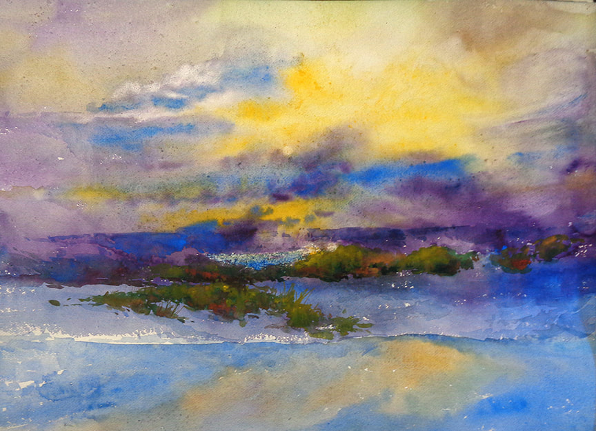 Step 3. Next is the foreground. I wanted the shrubs (yellow color) to pick up some light which helps to bring the foreground forward. With too much contrast and detail I could lose the unity and simplicity that I wanted. 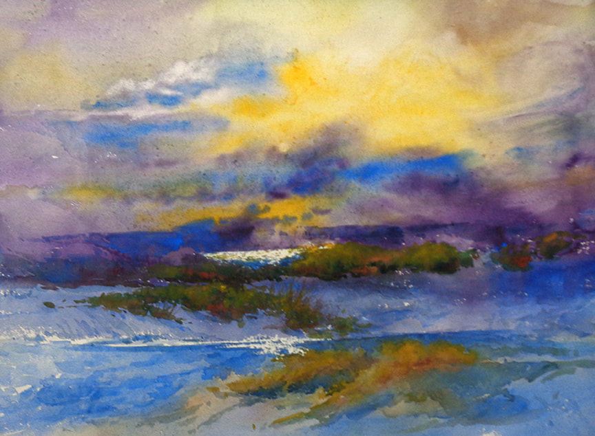 Step 4 In the final wash, I added a little more detail and contrast in the foreground. However, it lost a little “sparkle” when completed, so I decided to go to plan “B”. Scratching some highlights in the middle ground and a few in the foreground gave it the “sparkle” –but still not quite enough. Final.
I still needed more depth in the painting, so I “lifted” some of the color further back in the foreground, At the end of the painting, I always ask myself if it needs something. –more form? More color? Harder or softer edges. If the answer is that I think it needs something– then I am done. If the answer is yes– it needs something, then I will add to it, or correct it. Then I am done. 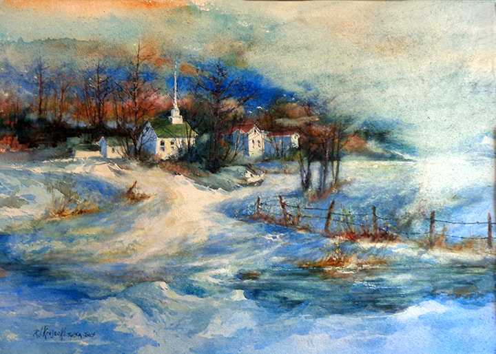 Step 5 Plan C!!! I did a sketch with the tree in the composition before I decided to put it in. Looked okay in the sketch but not so much in the painting. It took a lot of scrubbing to eliminate the tree. I then used a hair dryer to get that area VERY dry. I then sprayed the area with a heavy solution of gum arabic which is the “glue” used in and on the paper. That was dried immediately to seal the surface so that the planned wash in that area would match the colors in the background. I used that same procedure on the weeds on the river bank on the left to simplify the entire foreground 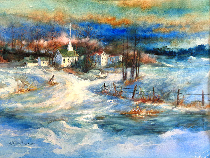 Step 7
I was able to rewet the area that I scrubbed and match the colors in the rest of the background. I added some very dark trees in that area to get more depth. The horizontal edge of the river bank is also eliminated as well as the weeds on the left. You would think that painting would be easier after painting for over 50 years! 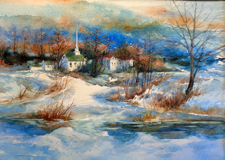 Step 4
At this point in the process, I realized that the river bank was too defined. Scrubbing near the middle softened the edge there, and darkening the right side softened that edge. I also decided that there was too much negative space in the painting. Adding a tree and some grasses on the right would would solve that problem and help to connect the foreground to the background by overlapping. 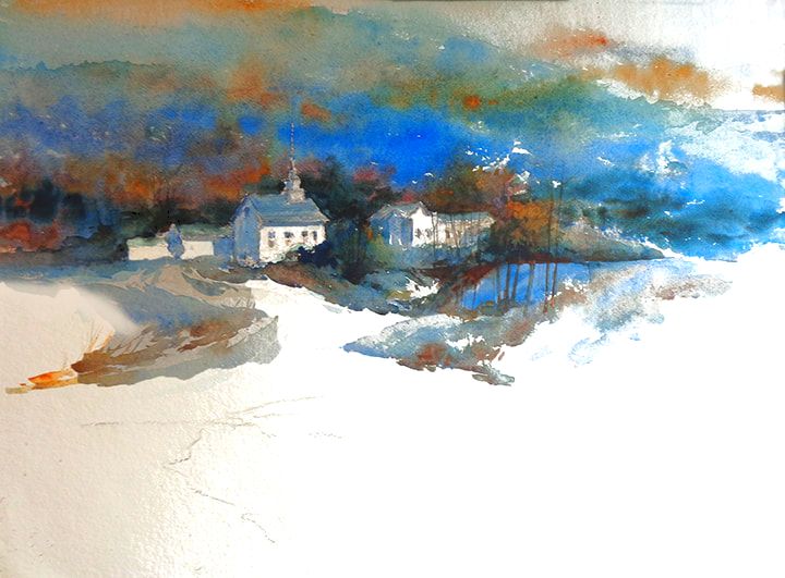 Step 2 The middle ground is painted next. The buildings, because they are the center of interest are painted light side and shadow. side. The ground and trees and shrubs are painted to “nestle” the buildings in the composition. 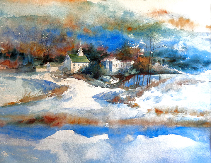 Step 3
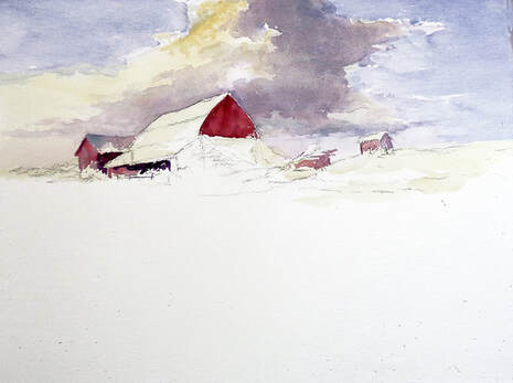
Rule 42- ”The success or failure of a painting occurs before you pick up a brush.” Planning is the key to any painting and is more important in a watercolor painting. Always have a plan B when painting just in case plan A needs adjusting.. I planned on a river bank with ice floes in the foreground. As soon as I finished this step I knew that It was a mistake. The brown river bank is much too horizontal which separates it from the rest of the composition and also flattens the picture space. I am using Khadi watercolor paper that is much more correctable than other papers which will make plan B possible 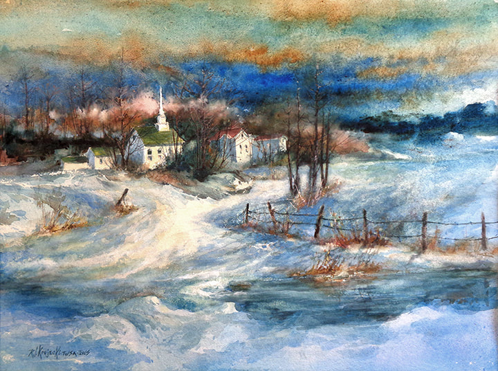 "On a Winters Day II"My latest large watercolor painting, 19.5" x 26" and how I did it! 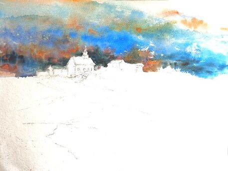 Starting with the background, I painted a very wet wash with Manganese Blue, Pthalo Blue, Cobalt Blue, Burnt Umber and Raw Sienna. The combination of staining, earth and metallic pigments enabled me to get more texture in the wash. Because the building will be painted light values, I had to paint around them which I don’t like to do. The alternative is to use a masking fluid to “protect” them so that I could paint “through” them. Painting up to the edge leaves hard edges that will have to be dealt with later. 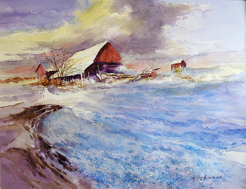 To finish, I added more texture in the foreground with opaque watercolor paint. I darkened the road and the darker portion of the clouds for balance and movement.
Although the painting is finished, I will put it away and then look at it again to see if anything needs to be added or subtracted. 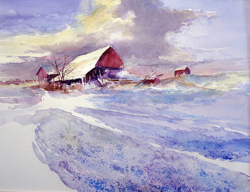 The foreground snow is next. I painted this area with the same colors that I used in the previous area of flat snow. While it is still wet, I added some salt. I also rewet the snow near it and added salt in the foreground. As the salt melts, it absorbs the pigment leaving a "speckled" affect which will give me the texture and detail needed to balance the composition. 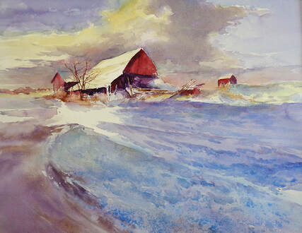 After removing the salt, you can see the varied texture in the snow in the foreground. Next is the dirt road on the left. The darker value gives the composition more depth and the shape creates visual movement to the old barn which is the center of interest. It also helps balance the composition with the value and color of the darks in the clouds.
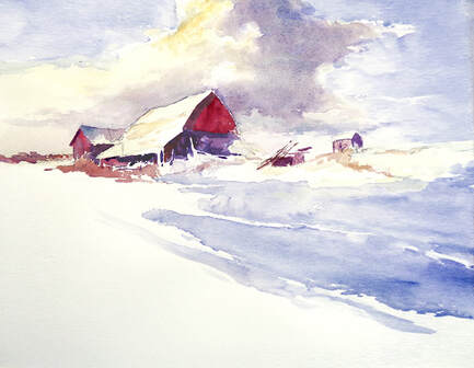 The large area of relatively flat snow is next and painted in sections because it is so large. I used some Cobalt Blue with Violet, lighter in the distance and a bit darker as I came forward. It is also darker on the right which is closer to the viewer and gets lighter into the distance. 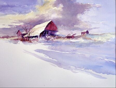 I usually paint into all of the white space so that I have a good idea of how the colors and values affect each other, but because the white space will remain negative space, I decided to add more form and detail to the positive spaces of the barn and areas around the barn.
 To make this painting more of a challenge, I chose a sheet of Arches 140 lb. cold press paper. I haven’t use that weight of paper for about 30 years. It tends to “buckle” if you use too much water. It is a full sheet of watercolor paper-22 x 30 inches.
The first wash was complex. To get the warm light in the clouds and on the roof of the large barn, I painted a wash of Quinacradone Gold mixed with some Cadmium Yellow Medium over the areas in the clouds and the roof and snow on the right. Timing is critical in watercolor. Too wet and everything runs together. Too dry and you will get a hard edge. Clouds have relatively soft edges, so I had to time the addition of the darker grayer side of the clouds and the gray blue of the sky when the yellow wash was still wet, but not so wet that the colors would run together. That also made it harder to get the soft edges of the clouds behind the barn because I had to paint “around” the roof of the large barn. I next painted the reds in the barns and waited for everything to dry before going on to the next step. |
Archives
March 2023
Categories |
 RSS Feed
