American Watercolor Society 155th International ExhibitThough we were unable to attend the event, my painting "Fishing On the Vermillion" made its way to New York to be displayed in the 155th International American Watercolor Society exhibit. Tony Armendariz, who also had a painting juried into the show, attended the event. He graciously took pictures of my painting in its spot in the exhibit. I didn't receive an award, but I'm still very proud to have been juried into this prestigious show. 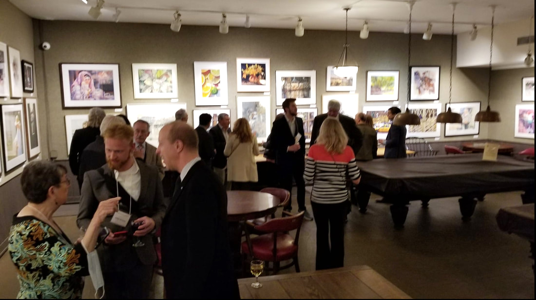 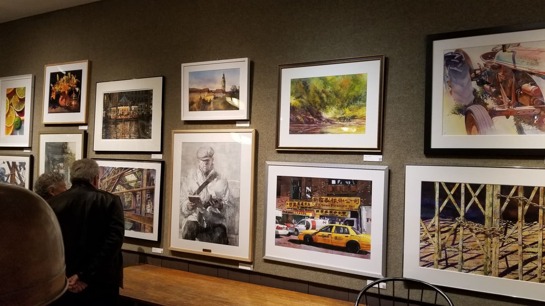 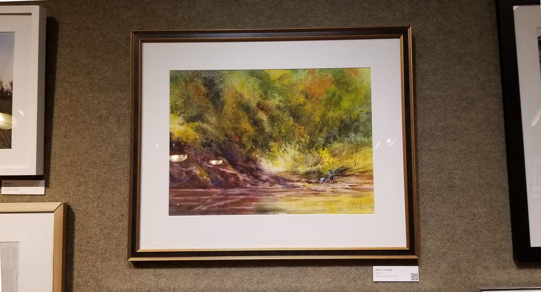
3 Comments
Correcting “failed” paintings in watercolor can be done with the addition of a little opaque paint. Keep in mind that watercolor paper is flexible and opaque paint is not. Opaque paint added too thickly will eventually crack. I will sometimes use acrylic white paint which remains flexible and can be used more heavily. This waterfall composition is done on Arches 300lb paper. The final painting is okay, but not as dynamic as I had planned.  To get more contrast, I darkened the darks in the background and changed the shapes of some of the rocks. I also darkened the rock near the center of interest, and added more water flow with the opaque white paint on the left side of the painting.  In the middle ground, I darkened and made the one rock on the left a bit warmer to bring it forward. Paying attention to the flow and movement of the water I added some opaque white.  The most difficult correction is in the large rock in the foreground. It is already very dark and large. Adding too much opaque paint would make it too different in relationship to the rest of the painting. I did darken it enough to break it into some smaller shapes and then lighten the top with some translucent paint for more form. I darkened the area flowing around the rocks and then added more movement in the water as it flows to the left in the foreground.  The final adjustments are subtle. The white space at the bottom was painted to match what is happening in the flow of the water. I added more opaque white paint to the highlights making sure that they were not as white as the whites in the center of interest. The final painting, although not compositionally much different than the original, is much more dramatic.
Before After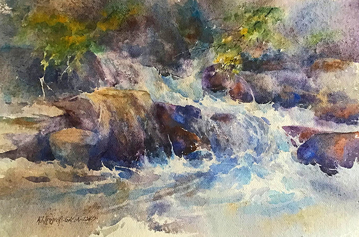 “Waterfall on Khadi”I submitted this painting into last year’s 2021 TWSA exhibition. However, it was not accepted into the show. After a fresh look, I had a decision to make: do I let it stand on its own merits, or make some adjustments? I could see it needed some improvements, so I added some definition to parts of the painting to get a stronger center of interest. That did not work. Major redo is the decision! The title of the painting refers to the watercolor paper that I used –Khadi, which is hand made in India. This paper is very different than any other paper that I use. It has a lot of surface sizing and almost no internal sizing.  I decided that the “greenery” in the upper part of the painting was too isolated and therefore had to be repeated elsewhere or eliminated. I did not see any logical place to repeat the greenery, so I decided it had to be eliminated altogether. I started by wetting and then blotting the upper right corner of the composition. That removed some of the pigment, but not enough, so I decided to try a more abrasive scrubbing pad which removed most of the pigment.  At that point, I decided that scrubbing the rest of the painting was safe so I did some heavy scrubbing in the top part of the painting and a lesser amount in the bottom portion. I then dried the painting with a hair drier. When throughly dried, I sprayed the entire painting with a strong solution of sizing -gum arabic. Without this sizing, the paper would soak up the paint like a blotter which would make it very difficult to control the edges of the rocks and water.  Without the greenery, the composition needed to be adjusted. I added more and darker rocks and changed their sizes in the upper portion of the composition. At this point, I was no longer concerned about the transparency, so I added some white gouache paint mostly in the water to create more drama and movement.  With the addition of the opaque paint, it gave me the ability to work transparent, translucent and opaque to achieve the movement of the water and the realistic affect of the water as it flows and is interrupted by the rocks. To achieve the darker values, I used a pigment given to me by my watercolor students–Yeliseyev Indigo, by American Journey. I am always concerned about the permanency of the pigments that I use and checked the label to see what kind of pigment it is. The Yeliseyev Indigo is a combination of PB27–Prussian Blue, which is permanent, and PV19 –Quinachradone Rose, one of the many new pigments that has been certified as permanent and PBK6 which is Lamp Black. One note about the color black. I NEVER use black in my paintings and discourage the use of black to my students. To quote Leonardo daVinci: “Black is like a broken vessel, which is deprived of the capacity to contain anything.” Why I never use black:
  The end result is a painting I believe is much better than the original.
Next step is to try this on some of my other failed paintings on different papers. 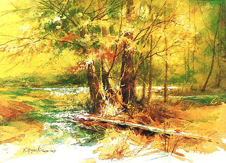 Final
This final step is always the scariest. After spending hours to get to this point in the painting, this last step can very easily ruin the painting. The advantage of transparent watercolor is in the layering. The more layers the more the painting will “glow”. To obtain that glow, I mixed some acrylic Cadmium Yellow Medium with water and sprayed the entire painting with that mixture. After it was totally dry, I used a hair dryer, sprayed another layer, and then a third and final layer. If you compare step 5 to the final you can see how much more intense it is. When the final layer was dry, I had to re-establish the white highlights to finish the painting.  Step 4
Next, I established the center of interest near the base of the trees and then added more branches and smaller trees. I used my coolest blue, Manganese Blue for the water to the left of the tree base.  Step 5
I painted the water and the opposite bank of the river first and then worked in all parts of the composition to establish detail and textures. I scratched highlights in the water and in some of the branches with a mat knife and wire brush. Every paper is different. The Khadi paper, because it has little or no internal sizing and because it is made with little or no long fibers, tears very easily, revealing a white that is whiter than the surface of the paper. So any scratching into the paper has to be done carefully.  Step 2 Most of the tree mass will be a middle value, so in Step 2 I established the few light values and some of the darks at the base of the tree. The darks are important for comparison. How light or dark the middle values will be can be compared to the darks in the tree trunk.  Step 3
The middle values in this step are in the background and the middle ground. The tree masses in the distance and on the right are further back and need to be a bit lighter and less intense than the tree mass in the middle ground. I also added just a small amount of red in the trees near the center to create more interest. While this wash was wet, I scratched some lines to indicate trees in the distance and branches in the main tree shape. Some scrubbing within the tree softened the edges and brought more light in the upper right side..  Most of the paintings that I do are in “full color”, which means that I will use all of the colors on my palette –3 reds, 3 blues, 3 yellows and several brown or earth colors, choosing a few of the colors as the dominant color theme. My choices for the dominant colors in this piece were: Cadmium Yellow Light, which is a cool yellow, Quinachradone Gold, which is yellow-orange, Pthalocyannine Green, which is a blue-green color, and Brown Madder, which is a red-brown color. The paper that I chose for the painting is Khadi with a rough texture. This paper has very little sizing in the paper, but a lot of surface sizing.
Step 1 in the process was wet in wet. I lightly sprayed the entire paper with water–wetter at the top, but not as wet toward the bottom. Because I want to leave some of the white of the paper at the bottom, it had to be almost dry when I got to that area. I started with a light wash of Quinachradone Gold, which is a very intense pigment, and then at the base of the trees with some Brown Madder and Pthalocyannine Green. By the time I reached the bottom portion of the painting, the paper was almost dry enabling me to work in selected areas of the white.  The subject for this painting is a grouping of trees along the Illinois River. I took the photo (below) a few years ago. Though initially it didn’t look very exciting, I saw many possibilities. I made changes in color, and adjustments in values to make it work. I decided to paint it as a fall scene instead of mid-summer as in the photograph.   I added small rocks in the foreground and continued “forming” the water. To keep the attention in the center of interest, I didn’t add much detail to the foreground.
|
Archives
March 2023
Categories |


 RSS Feed
