|
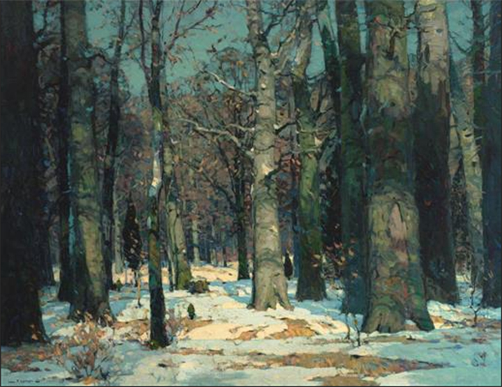
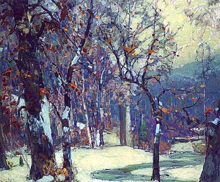
My "bible" for art is Carlson's Guide to Landscape Painting. I recommend it to all of my students with one caveat-it can be difficult to read! Reading and studying one or two pages at a time is the best way to understand all that Mr. Carlson has to teach. In Chapter 5, he discusses "Transitions in Value and Color." "One of the most important truths bearing upon receding color out-of-doors is this: it is the yellow that fades out of a landscape as it recedes from the foreground. This means not only yellow itself, but the yellow in all mixtures, such as brown, warm red, orange, etc. Our green for example, will range from a sappy yellow-green in the foreground to quite a cool green in the middle distance and gradually diminish in its yellowness as it goes further back, until it turns to a faint emerald in the distance; and this emerald will become a faint greenish-blue at the horizon. Again, it is the yellow that fades out of receding planes. As the yellow fades out, the violets and blues seem to increase in intensity." These examples of his paintings illustrate the concept.  Once you understand that you have to eliminate the yellow as you paint into the background, you then have to understand the pigments that you use. In my March blog I experimented with the Zorn palette which incorporates a red, yellow, blue and black. Using this palette makes your choices easy. Just stop using the yellow as you paint into the background. If you use a more typical palette of colors, your choices become more complex. Above are the colors that I use. Some of the colors are obvious, such as Cadmium yellow light, Cadmium yellow medium, and Raw Sienna. And some are not. For example, while Cadmium Red Light is a red, it also contains some yellow. Cerulean Blue is a blue that also contains yellow. You have to know your color composition before you can use this concept effectively. To further clarify, as you look at the traditional 12 segment color wheel below, you can see the colors that have yellow in them are below the red line, and the colors that do not contain yellow are above the red line.  Below is one of my recent watercolor paintings-"Maple Hollow Summer", showing this concept. You can see the cooler blues and greens in the background, and the yellows and greens in the foreground. 
1 Comment
|
Archives
March 2023
Categories |

 RSS Feed
